Graphic Design - Television/Video
Static Graphics - Graphics that do not move on the screen
Graphics are everywhere on the television and computer screens today. They have become an important "production element" to enhance a television or video production.
Well designed graphics present information in a visually interesting way without stealing the show! The graphic "look" is an important part of creating an identity or branding a TV show, TV station or TV network. Virtually all Youtube content creator have their own distinctive and identifiable graphic look.
Whether for television, the web or print, learning to create visually engaging graphics can lead to a personally satisfying and lucrative creative career.
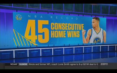
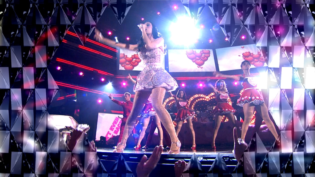
Full Page Exemplars
A few examples of professionally produced "full page" graphics used by television networks.
A few examples of professionally produced "full page" graphics used by television networks.

|


|
Introduction to Graphic Design
Examples of 5 commonly used graphics for video production
On-set Graphic Designs
|

|
|
|
Graphic Design Concepts
|
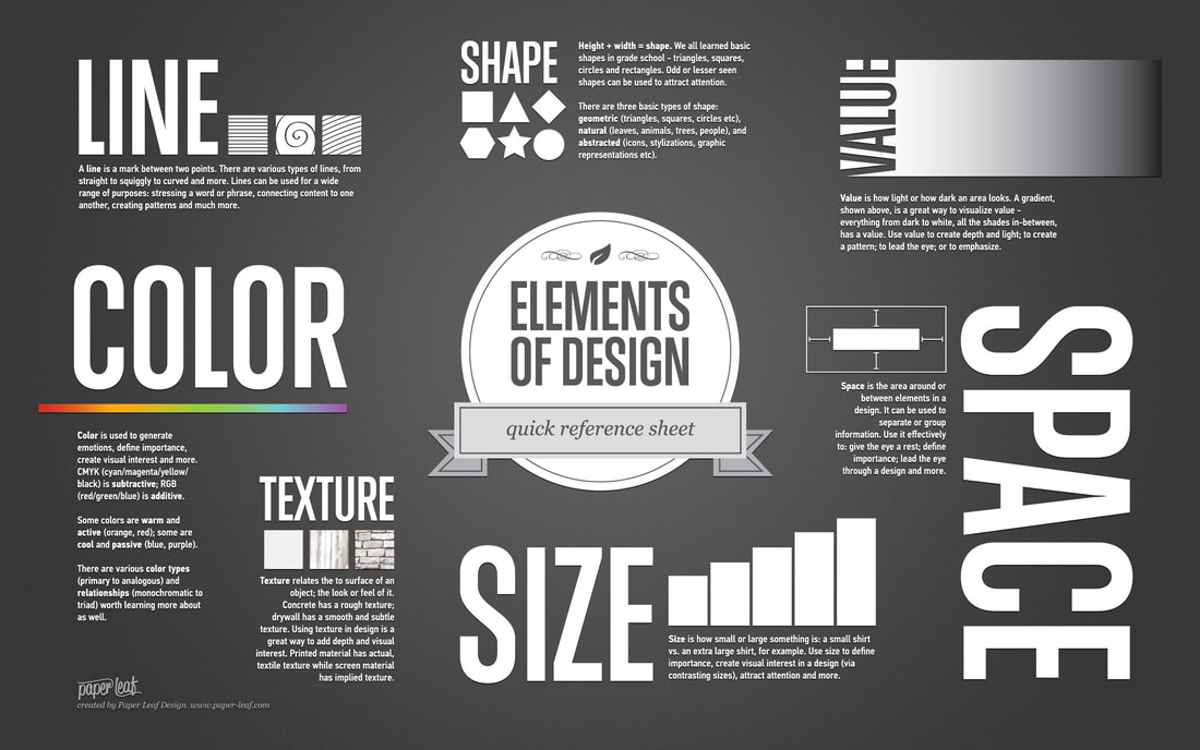
Elements of Design
|
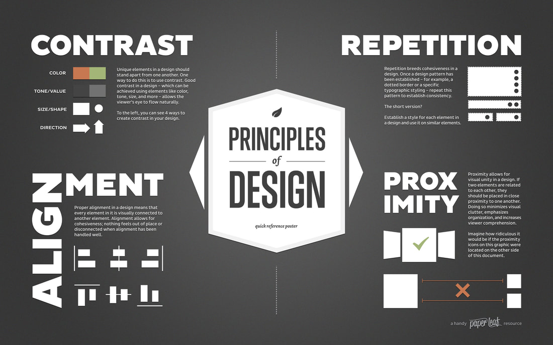
Principles of Design
|
Design Fundamentals and Layout Concepts
|
|
Design Elements
What you use in your design
|
Layout and Composition
Where Design elements are placed in the design and in relation to one another
Where Design elements are placed in the design and in relation to one another
|
|
The foundations of Visual Design
|
3 Tips to create professional looking graphics
Keep it Simple
(But not too simple!)
In other words, the tendency of beginner graphic designers is to include too many different design elements so that their graphic design to grab attention. Beginner designers will mix in too many colours and too many font choices with the hope it looks good. Resist this urge. Usually 2 or 3 colours and fonts are enough to create an eye catching but professional looking design.
Hierarchy
Create hierarchy of graphic elements. What will standout to the viewer first, second...
Not all graphic elements should have the same visual emphasis as others. For example, on a lower third graphic the written text identifying the speaker and their connection to the topic is probably the most important information. The text must standout to be easily legible. The colours and shapes/logos used add visual interest without being distracting.
Consistency
Be consistent with layout, colours and typography within a single video item
Creating and using graphics that have a common and consistent "look" is critical to successfully create what is referred to as a "graphic" package for a video item or entire show. Consistent graphics become an identifiable branding of the video item. Be consistent in sale, alignment, colours, logos used in a design. A lower third should have exactly the same look as all others in a video. The only information that should change is the written text which provides the viewer with information about the speaker.
Techniques to create Hierarchy within a graphic design (order of importance)
Design Principles
Use these techniques for best results when beginning graphic design.
You will likely be very successful creating a graphic which is visually pleasing graphics.
1. Scale - we tend to notice largest design elements first
2. Alignment/Positioning - We read left to right.
Position graphic elements so they lead our eyes - left to right/top to bottom
3. Contrast - This just means differences between individual design elements
Scale/Size
Colour
Light/Dark - Known as "Value" or Brightness
5. Font style - select a font style that is easily read (often "Sans Serif").
Remember, a graphic is only on the screen for about 5 seconds. Selecting a font that is difficult to
6. Colour - Choosing colours is the most difficult aspect of designing graphics.
Use a maximum of 2 colours combined with white and/or black. Too many colours confuse the viewer and can make the graphic information difficult to read. Colours can be inspired by the theme of the item or the show. Example: This is close to (not exact) Castlebooke green which is why I use throughout my website
Graphic Identity Assignment:
Duration: 2 Periods
Online, find and download an example of each type of commonly used graphic. Present the 6 exemplars you have chosen in 1 Photoshop document.
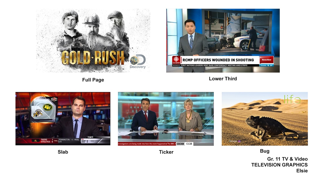
1. Full page
2. Lower Third
3. Slab - left or right
4. On-Set
5. Bug
6. Ticker
Duration: 2 Periods
Online, find and download an example of each type of commonly used graphic. Present the 6 exemplars you have chosen in 1 Photoshop document.
- Pay close attention to the alignment of the images on the page - be consistent with tops and edges of each image on the page. Label each graphic identifying each type of graphic. See above.
- Choose black text and be consistent with font style, scale and position/alignment
1. Full page
2. Lower Third
3. Slab - left or right
4. On-Set
5. Bug
6. Ticker
Lower Third Inspirational Graphic Design Assignment:
Additional Graphic creation in Photoshop Tutorials
https://elsiecommtech.weebly.com/static-graphics---video-tutorials1.html
Part 1
Photoshop Static Graphic
In Photoshop, students will create static graphics for the class television show.
Students will use design techniques demonstrated in class. Students will use tools and techniques covered in class. They may also ask for assistance if a technique they need to know has not been covered as part of the usual lessons. They teacher will demonstrate techniques students want to use in their own designs.
Students are expected to:
Each student will design 1 static lower third graphic
Assignment Requirements
Part 1 - Photoshop Static Graphic
Students will submit their stages of the graphic design assignment in a Google Slides document. Students will provide a link to their Google slide in d2l - day 1
Stage 1 - Research person of Inspiration
Students will research a person of inspiration and create a lower third for that person. Students will
Write a short paragraph explaining what makes the person of their choice inspirational. Person chosen must be school appropriate.
Stage 2 - Inspirational Design Board
Second Stage is to create a design inspiration board for the person of your choice
Stage 3 - Sketch 2 layouts
Stage 4 - Graphic Creation in Photoshop
Look Fors
Demonstrate alignment Principles of Design:
Hierarchy - Obvious order of importance or elements
Alignment of elements and organization on the page - Leads the eye on the graphic
Proximity of elements
Contrast - Scale, colour
Colour Harmony - Create a colour scheme that supports the overall graphic
Hard Copy Submission to Teacher:
Part 2 - After Effects - Graphic Animation
In After Effects, students will animate the completed Lower Thirds TV graphic from Part 1. Students are required to animate each element of the graphic using the lessons, tools and techniques taught in class.
Additional Graphic creation in Photoshop Tutorials
https://elsiecommtech.weebly.com/static-graphics---video-tutorials1.html
Part 1
Photoshop Static Graphic
In Photoshop, students will create static graphics for the class television show.
Students will use design techniques demonstrated in class. Students will use tools and techniques covered in class. They may also ask for assistance if a technique they need to know has not been covered as part of the usual lessons. They teacher will demonstrate techniques students want to use in their own designs.
Students are expected to:
Each student will design 1 static lower third graphic
- Demonstrate effective use of design elements - Text, Shapes, Images etc.
- Demonstrate effective ability to apply Design Principles - Alignment, Contrast etc.
- Graphic should be simple to visually navigate yet have a level of subtle complexity
Assignment Requirements
Part 1 - Photoshop Static Graphic
Students will submit their stages of the graphic design assignment in a Google Slides document. Students will provide a link to their Google slide in d2l - day 1
Stage 1 - Research person of Inspiration
Students will research a person of inspiration and create a lower third for that person. Students will
Write a short paragraph explaining what makes the person of their choice inspirational. Person chosen must be school appropriate.
Stage 2 - Inspirational Design Board
Second Stage is to create a design inspiration board for the person of your choice
- Include "artifacts" that include design inspirations that connect to your person. Include things such as logos, connections to their interests, colours and perhaps textures that are inspired by the image
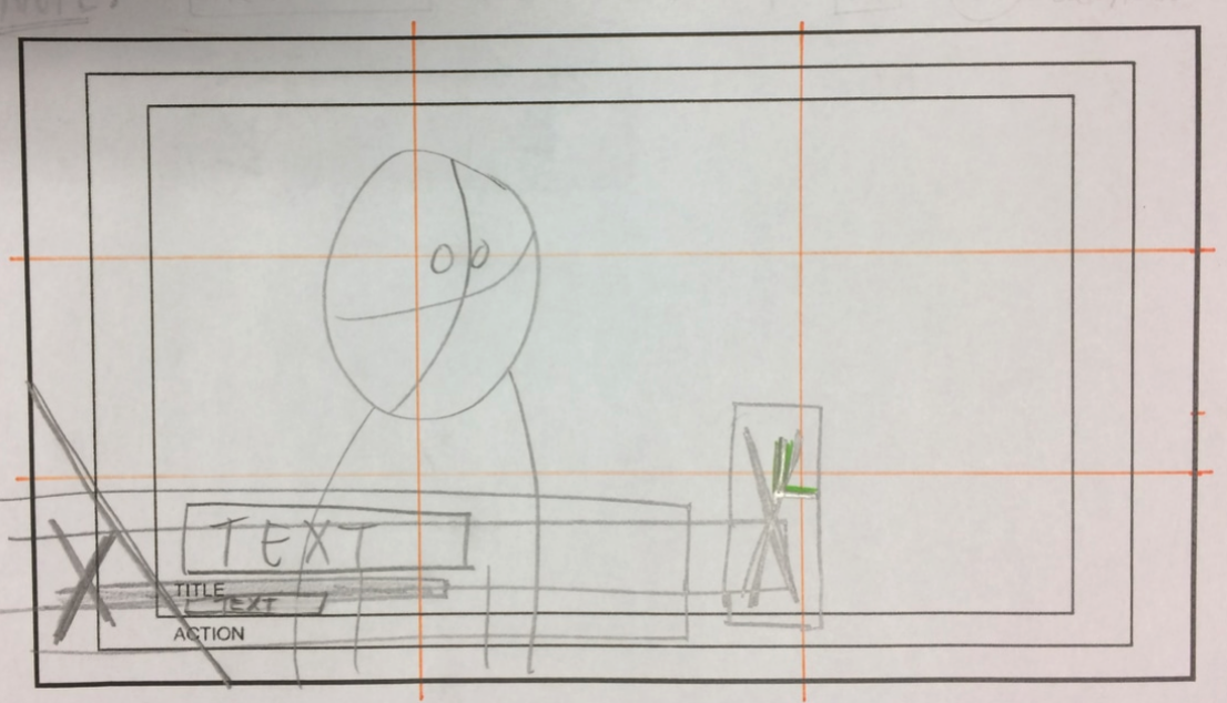
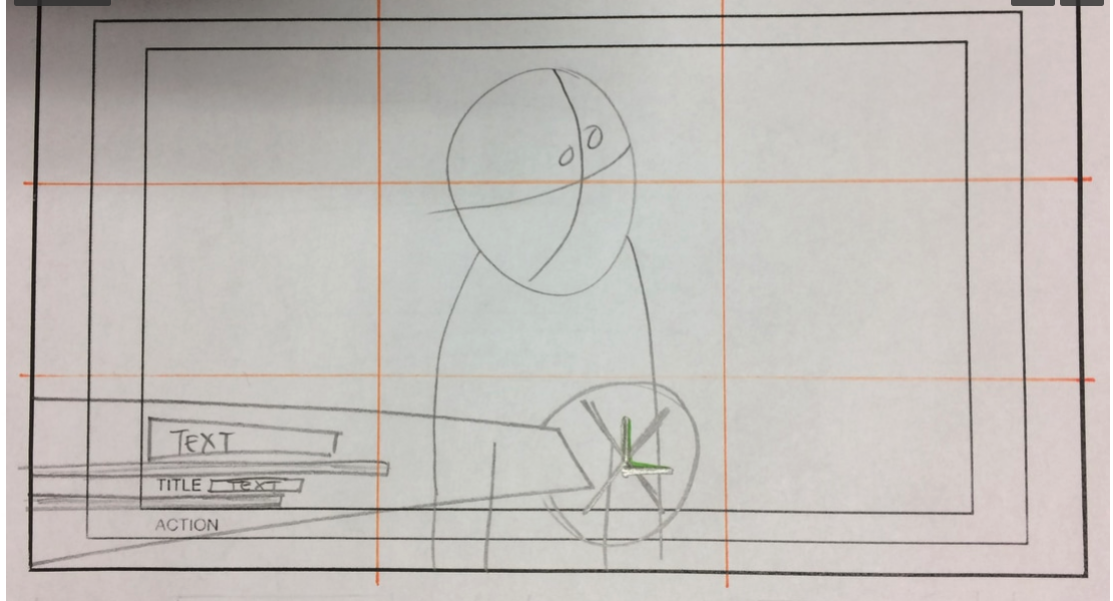
Stage 3 - Sketch 2 layouts
- 2 layout design sketches developed to communicate different lower thirds design layouts
- Includes “Title Safe and Safe Action Overlay” layer (video actions)
- Includes all four graphic elements as follows:
- 3 shapes minimum (1 shape acts as a text line separator)
- 1 logo or photo
- 2 lines of text minimum
Stage 4 - Graphic Creation in Photoshop
- Main image of inspirational person best if follows the “Rule of Thirds” and favour the left or right vertical line
- Downloaded images must not include any graphic elements (ie: shapes, text, or logos)
- All downloaded images must be high quality (minimum of 1920 x 1080 pixels)
- Must include at least 1 logo or image that is cut out
- No distortion or stretching of downloaded images
- Must cut out at least 1 image in the design - using Magic Wand or Quick Selection
- Must include 3 shapes min. - 1 must be customized - ie. angled edge of curved edge etc.
- Must include a line in the design - line tool
- 2 lines of text minimum - 2 line lower third with relevant information
- Maximum 2 different fonts used in the design
- Typography (font style and size) must complement the graphic elements and the chosen person of inspiration
- Colour scheme must complement the graphic theme
- Must use 1 layer style for an element
- All layers must be given a name that identifies the layer content appropriately
Look Fors
Demonstrate alignment Principles of Design:
Hierarchy - Obvious order of importance or elements
Alignment of elements and organization on the page - Leads the eye on the graphic
Proximity of elements
Contrast - Scale, colour
Colour Harmony - Create a colour scheme that supports the overall graphic
Hard Copy Submission to Teacher:
- 2 layout design sketches of lower thirds graphic ideas
- Submit Link to Google Slide Presentation - Include all 4 stages
- Separately submit Photoshop file (.psd) and Photoshop PDF file (.pdf) in your folder
- Files named as “Student Name_Lower Thirds Inspire TV GFX”
Part 2 - After Effects - Graphic Animation
In After Effects, students will animate the completed Lower Thirds TV graphic from Part 1. Students are required to animate each element of the graphic using the lessons, tools and techniques taught in class.
Sketching Symbols
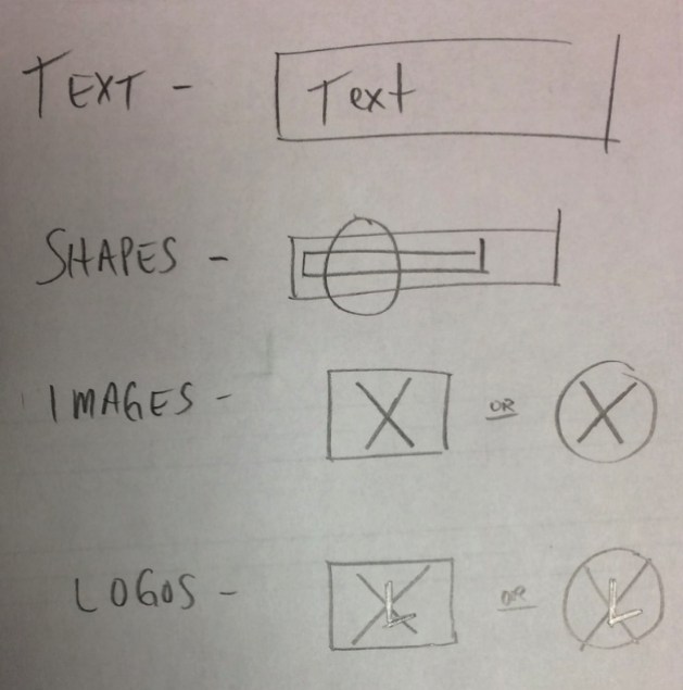
Sketching Exemplars
|
|
This video is an introduction into the use of typography or text in a graphic design |
This video is an introduction into the use of colour in a graphic design |
Colour Theory
Choosing a colour scheme is hard to do!
Deciding on which colours to choose for any design is quite difficult. However, as difficult as it is, choosing colours is an extremely important aspect of graphic design. It can take years of experience to "train" our eyes to see colour combinations that work well together. Combining multiple colours in a single design is called a colour scheme.
Science of colour
Using the "Colour Wheel"
One approach that is applied when starting out is using the colour wheel. This document shows how the colour wheel is used to help pick colour combinations that complement each other.
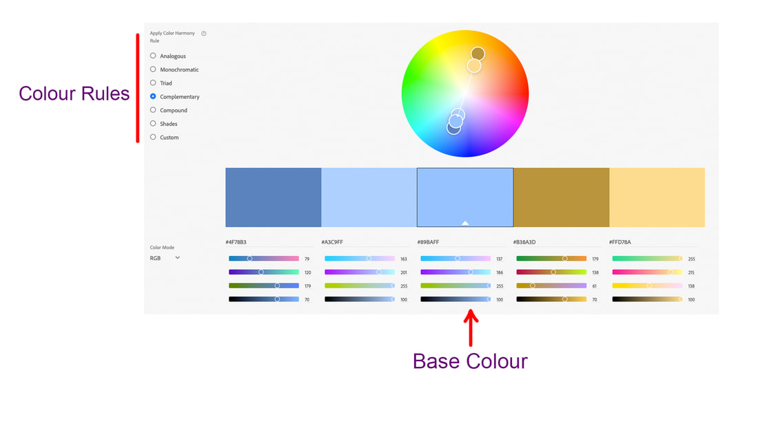
Another Approach is to use a colour picking tool to help decide which colours work well together. Adobe has an excellent tool for creating a colour scheme. The basic concept is to pick your main colour - known as the Base colour and then select a colour rule to determine colours that would compliment the base colour.
https://color.adobe.com/create
Choosing a colour scheme is hard to do!
Deciding on which colours to choose for any design is quite difficult. However, as difficult as it is, choosing colours is an extremely important aspect of graphic design. It can take years of experience to "train" our eyes to see colour combinations that work well together. Combining multiple colours in a single design is called a colour scheme.
Science of colour
Using the "Colour Wheel"
One approach that is applied when starting out is using the colour wheel. This document shows how the colour wheel is used to help pick colour combinations that complement each other.
Another Approach is to use a colour picking tool to help decide which colours work well together. Adobe has an excellent tool for creating a colour scheme. The basic concept is to pick your main colour - known as the Base colour and then select a colour rule to determine colours that would compliment the base colour.
https://color.adobe.com/create
Graphic Creation Exemplar
Re-create this lower third graphic. The image is of Gord Downie of the iconic Canadian music group "The Tragically Hip."
Gord Downie is more than the lead singer of Tragically Hip. He has been a faithful advocate of native Canadian issues. He is battling a terminal form of brain cancer but performed in the group's farewell tour in the summer of 2016.
Practice Graphic
Download the required graphic assets (files) from the links below

|
| ||||
| cdn_flag.jpg |
After Effect Tutorials
Importing Photoshop Files into After Effects
Watch this tutorial courtesy of Mahalodotcom
Importing Photoshop Files into After Effects
Watch this tutorial courtesy of Mahalodotcom
|
|
|
Animating Photoshop Files in After Effects
|
|
|
|
|
|
EC Abrahams
He is an excellent resource on Youtube to learn a wide variety of visual effects. His tutorials tend to be for people who already have a basic knowledge of After Effects. Check him out online.
He is an excellent resource on Youtube to learn a wide variety of visual effects. His tutorials tend to be for people who already have a basic knowledge of After Effects. Check him out online.
