Graphic Design Skills - Gr. 11
This unit will develop and extend the students' graphic design skills. The unit focuses on image editing and creative graphic creation using industry standard Photoshop/Photopea.
This grade 11 unit will explore more advanced image editing techniques that builds on previous knowledge.
All students can be successful no matter their level of knowledge and skill as they begin this unit. All students will be supported by the teacher and video tutorials demonstrating a variety of image editing techniques.
In this unit students will produce creative Static Graphics given the online status of the course.
This unit will build student Photo image editing skills. Students can use either Photoshop or Photopea.com to complete these assignments. Photopea is a free online program that works almost identical to Photoshop. The tools of both programs are essentially the same and the assignments can be completed with either program.
Photopea.com - you can download and install or work right from within your internet browser. Google Chrome is best used as your browser for this course as it will mirror the browser your teacher will use.
Photopea is compatible with PC, MAC and Google Chromebooks.
Graphic Design - Television/Video
Graphics appear everywhere on videos for television and computer screens. They have become an important part of a video "production design" that enhances a video production.
The graphic "look" is an important part of creating an identity or branding a TV show, TV station or TV network. Well designed graphics present information or leaves the viewer with a visual impression in an interesting way. Virtually all Youtube content creator have their own distinctive and identifiable graphic look.
Whether for television, the web or print, learning to create visually engaging graphics can lead to a personally satisfying and lucrative creative career.
Introduction to Graphic Design
Review
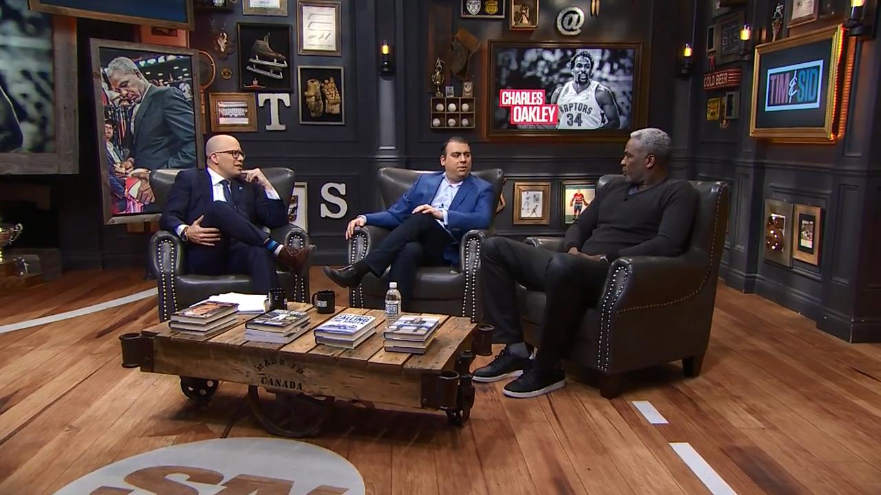
5 commonly used types of graphics in video production
5 commonly used types of graphics in video production
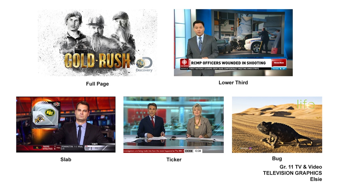
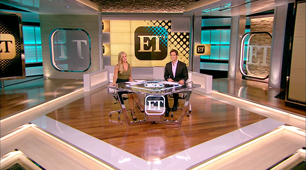
Full Page Exemplars
A few examples of professionally produced "full page" graphics used by television networks.
A few examples of professionally produced "full page" graphics used by television networks.
|

|
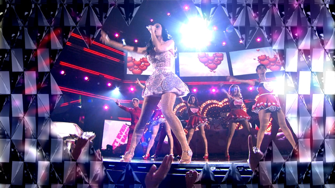
"On-set" Graphic Designs
|

|
|
|
Tips to create professional looking graphics
Establish Hierarchy in every design
Think of hierarch as what is given "emphasis" in each design.
Simply stated, what will be noticed first, second third...on your design. There should be
The visual flow within a graphic design that emphasizes what should standout first, second, third and so on.
Can be a visual (photo) or text (Title)
Everything within a design should not appear to have the same level of importance
Not all graphic elements should have the same visual emphasis as others. For example, on a lower third graphic the written text identifying the speaker and their connection to the topic is probably the most important information. The text must standout to be easily legible. The colours and shapes/logos used add visual interest without being distracting.
Don't "over design"
This is a hard tendency to avoid
Keep your graphic visually clean and simplistic looking. Do not try to include too many different design elements on your graphic designs. This will crate a confusing
At the same time your graphics should have a level
In other words, the tendency of beginner graphic designers is to include too many different design elements so that their graphic design to grab attention. Beginner designers will mix in too many colours and too many font choices with the "hope" it looks good. Resist this urge.
Unity
Be consistent with layout (placements of design elements within a design), colours and typography within a graphic design
In video production maintaining a consistent design or "look" is critical to successfully create what is referred to as a "graphic" package for a video item or entire show. Unique but Consistent graphic design becomes identifiable to a viewer - this is called branding. There must be a visual connection between graphical content - all graphics should use fonts and colours that are consistent in all graphical designs, even though the graphics vary as to how they are used on the screen - Lower third, full page, bug.
Creating Hierarchy within a graphic design
This is an important concept in graphic design
Hierarchy simply means that some graphic elements need more visual emphasis over other elements to effectively communicate the information presented.
For example, the text (information) is likely more important than the shapes and colours to communicate information. If the text gets "lost" in the design by competing elements it will not be effective. Other elements are included to make the graphic visually interesting and to anchor and connect all the elements of the design. But the text needs to clearly stand out first. Other design elements should be thought of as supporting the message without getting in the way of the message.
in a design are meant to stand out over other elements.
It may be because there are words in the design that should stand out to more than others. Or conversely, the shapes in the design are meant to anchor other design elements but not distract for the information being communicated by the graphic.
For example, in a 2 line lower third graphic
Use these techniques for best results when beginning graphic design.
You will likely be very successful creating a graphic which is visually pleasing graphics.
Hierarchy
Overall graphic design concept
1. Scale - we tend to notice largest design elements first
2. Positioning/Alignment - Position graphic elements so they lead our eye through a design. Group and organize elements/information together that are connected to separate them together but separate from other design elements.
3. Contrast
Simply means there is a "difference" between graphic elements. Not all elements should have the same emphasis. Some elements are more important that others and should stand out or have a higher Higher hierarchy in the d.
Light vs. Dark,
Large vs. Small,
Difference in colour of text or shapes to draw the eye
Establish Hierarchy in every design
Think of hierarch as what is given "emphasis" in each design.
Simply stated, what will be noticed first, second third...on your design. There should be
The visual flow within a graphic design that emphasizes what should standout first, second, third and so on.
Can be a visual (photo) or text (Title)
Everything within a design should not appear to have the same level of importance
Not all graphic elements should have the same visual emphasis as others. For example, on a lower third graphic the written text identifying the speaker and their connection to the topic is probably the most important information. The text must standout to be easily legible. The colours and shapes/logos used add visual interest without being distracting.
Don't "over design"
This is a hard tendency to avoid
Keep your graphic visually clean and simplistic looking. Do not try to include too many different design elements on your graphic designs. This will crate a confusing
At the same time your graphics should have a level
In other words, the tendency of beginner graphic designers is to include too many different design elements so that their graphic design to grab attention. Beginner designers will mix in too many colours and too many font choices with the "hope" it looks good. Resist this urge.
- Maximum 2 or 3 fonts - otherwise the eye becomes confused
- Don't overuse colour on the page - can overwhelm and confuse the eye
Unity
Be consistent with layout (placements of design elements within a design), colours and typography within a graphic design
In video production maintaining a consistent design or "look" is critical to successfully create what is referred to as a "graphic" package for a video item or entire show. Unique but Consistent graphic design becomes identifiable to a viewer - this is called branding. There must be a visual connection between graphical content - all graphics should use fonts and colours that are consistent in all graphical designs, even though the graphics vary as to how they are used on the screen - Lower third, full page, bug.
Creating Hierarchy within a graphic design
This is an important concept in graphic design
Hierarchy simply means that some graphic elements need more visual emphasis over other elements to effectively communicate the information presented.
For example, the text (information) is likely more important than the shapes and colours to communicate information. If the text gets "lost" in the design by competing elements it will not be effective. Other elements are included to make the graphic visually interesting and to anchor and connect all the elements of the design. But the text needs to clearly stand out first. Other design elements should be thought of as supporting the message without getting in the way of the message.
in a design are meant to stand out over other elements.
It may be because there are words in the design that should stand out to more than others. Or conversely, the shapes in the design are meant to anchor other design elements but not distract for the information being communicated by the graphic.
For example, in a 2 line lower third graphic
Use these techniques for best results when beginning graphic design.
You will likely be very successful creating a graphic which is visually pleasing graphics.
Hierarchy
Overall graphic design concept
1. Scale - we tend to notice largest design elements first
2. Positioning/Alignment - Position graphic elements so they lead our eye through a design. Group and organize elements/information together that are connected to separate them together but separate from other design elements.
3. Contrast
Simply means there is a "difference" between graphic elements. Not all elements should have the same emphasis. Some elements are more important that others and should stand out or have a higher Higher hierarchy in the d.
Light vs. Dark,
Large vs. Small,
Difference in colour of text or shapes to draw the eye
- Text Font styles/scale - Text on the design should vary in colour and scale should be dominate. Maximum 3 recommended on any design.
- Colours - use of different but complimenting colours.
- use of light vs. dark, or using colours that
- Choosing colours is the most difficult aspect of designing graphics.
- Choosing colours is the most difficult aspect of graphic design for man. Not everyone sees how different colours work well together - or NOT.
- Generally, use a maximum of 2 colours combined with white and/or black. A third colour can be used if it is only a small detail or accent to the overall graphic - for example, a thin line or a single word or letter.
- Too many colours confuse the viewer and can make the graphic information difficult to read. Colours can be inspired by the theme of the item or the show. Example: This is close to (not exact) Castlebooke green which is why I use throughout my website to maintain unity throughout my site and provide emphasis for titles or important concepts.
Colour Theory
Choosing a colour scheme is hard to do!
Deciding on which colours to choose for any design is quite difficult. However, as difficult as it is, choosing colours is an extremely important aspect of graphic design. It can take years of experience to "train" our eyes to see colour combinations that work well together. Combining multiple colours in a single design is called a colour scheme.
Science of colour
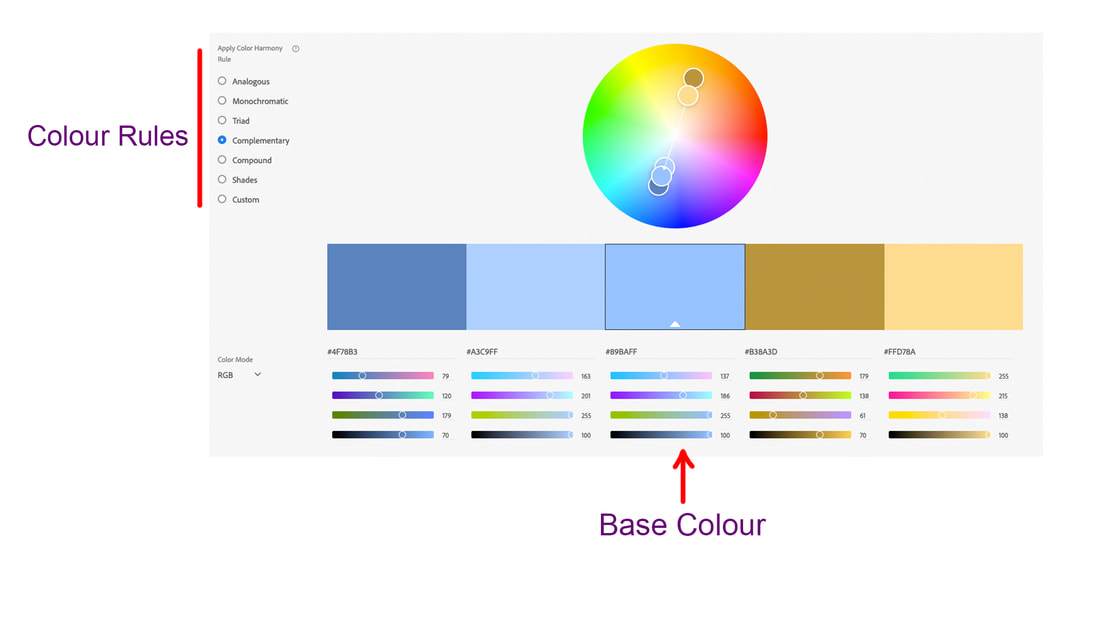
Using the "Colour Wheel"
One approach that is applied when starting out is using the colour wheel. This document shows how the colour wheel is used to help pick colour combinations that complement each other.
Another Approach is to use a colour picking tool to help decide which colours work well together. Adobe has an excellent tool for creating a colour scheme. The basic concept is to pick your main colour - known as the Base colour and then select a colour rule to determine colours that would compliment the base colour.
https://color.adobe.com/create
Choosing a colour scheme is hard to do!
Deciding on which colours to choose for any design is quite difficult. However, as difficult as it is, choosing colours is an extremely important aspect of graphic design. It can take years of experience to "train" our eyes to see colour combinations that work well together. Combining multiple colours in a single design is called a colour scheme.
Science of colour
Using the "Colour Wheel"
One approach that is applied when starting out is using the colour wheel. This document shows how the colour wheel is used to help pick colour combinations that complement each other.
Another Approach is to use a colour picking tool to help decide which colours work well together. Adobe has an excellent tool for creating a colour scheme. The basic concept is to pick your main colour - known as the Base colour and then select a colour rule to determine colours that would compliment the base colour.
https://color.adobe.com/create
Graphic Creation Exemplar
Re-create this lower third graphic. The image is of Gord Downie of the iconic Canadian music group "The Tragically Hip."
Gord Downie is more than the lead singer of Tragically Hip. He has been a faithful advocate of native Canadian issues. He is battling a terminal form of brain cancer but performed in the group's farewell tour in the summer of 2016.
Graphic Identity Assignment
Duration: 2 Periods
Online, find and download an example of each type of commonly used graphic. Present the 6 exemplars you have chosen in 1 Photoshop document.
1. Full page
2. Lower Third
3. Slab - left or right
4. On-Set monitors
5. Bug
6. Ticker
Duration: 2 Periods
Online, find and download an example of each type of commonly used graphic. Present the 6 exemplars you have chosen in 1 Photoshop document.
- Pay close attention to the alignment of the images on the page - be consistent with tops and edges of each image on the page. Label each graphic identifying each type of graphic. See above.
- Choose black text and be consistent with font style, scale and position/alignment
1. Full page
2. Lower Third
3. Slab - left or right
4. On-Set monitors
5. Bug
6. Ticker
Download the required graphic assets (files) from the links below

|
| ||||
| cdn_flag.jpg |
Assignment 2: Inspirational TV Graphic
Part 1 - Photoshop Graphic
In Photoshop, students will create a static graphic for high definition television based on the lessons, tools and techniques taught in class. Students will create a lower thirds television graphic based on an iconic inspirational figure in their life. Students must first develop a minimum of three layout design sketches that communicate two different layout ideas for their lower thirds graphic. The completed Photoshop graphic must include all four graphic elements; shapes, image, text and logo. In addition, a colour scheme for the graphic will be created. Remember, colours must complement not compete with all graphic elements and background image.
Part 2 - After Effects
In After Effects, students will animate the completed Lower Thirds TV graphic from Part 1. Students are required to animate each element of the graphic using the lessons, tools and techniques taught in class.
Requirements
Part 1 - Photoshop Graphic
Hard Copy Submission to Teacher:
Part 1 - Photoshop Graphic
In Photoshop, students will create a static graphic for high definition television based on the lessons, tools and techniques taught in class. Students will create a lower thirds television graphic based on an iconic inspirational figure in their life. Students must first develop a minimum of three layout design sketches that communicate two different layout ideas for their lower thirds graphic. The completed Photoshop graphic must include all four graphic elements; shapes, image, text and logo. In addition, a colour scheme for the graphic will be created. Remember, colours must complement not compete with all graphic elements and background image.
Part 2 - After Effects
In After Effects, students will animate the completed Lower Thirds TV graphic from Part 1. Students are required to animate each element of the graphic using the lessons, tools and techniques taught in class.
Requirements
Part 1 - Photoshop Graphic
- 3 layout design sketches developed to communicate different lower thirds design layouts
- Includes “Title Safe and Safe Action Overlay” layer (video actions)
- Includes all four graphic elements as follows:
- 3 shapes minimum (1 shape acts as a text line separator)
- 1 logo minimum
- 2 lines of text minimum
- Alignment and position of graphic elements are organized lead the eye
- All graphic elements work well together as complete design
- Typography (font style and size) must complement the graphic elements and the chosen person of inspiration
- Colour scheme must complement the graphic elements and the chosen person of inspiration
- Main image of inspirational person must follow the “Rule of Thirds” and favour the left vertical line or be center aligned
- Downloaded images must be high quality (minimum of 1920 x 1080 pixels)
- No distortion or stretching of downloaded images
- Downloaded images must not include any graphic elements (ie: shapes, text, or logos)
- All layers must be given a name that identifies the layer content appropriately
Hard Copy Submission to Teacher:
- 3 layout design sketches of lower thirds graphic ideas
- Create your own folder on the server folder title your name
- Submit Photoshop file (.psd) and Photoshop PDF file (.pdf) in your folder
- Files named as “Student Name_Lower Thirds Inspire TV GFX”
After Effect Tutorials
Importing Photoshop Files into After Effects
Watch this tutorial courtesy of Mahalodotcom
Importing Photoshop Files into After Effects
Watch this tutorial courtesy of Mahalodotcom
|
|
|
Animating Photoshop Files in After Effects
|
|
|
|
|
|
EC Abrahams
He is an excellent resource on Youtube to learn a wide variety of visual effects. His tutorials tend to be for people who already have a basic knowledge of After Effects. Check him out online.
He is an excellent resource on Youtube to learn a wide variety of visual effects. His tutorials tend to be for people who already have a basic knowledge of After Effects. Check him out online.
